
Daily Addict
Lifestyle and city information guide: restaurant reviews, highly-sought-after products, exclusive travel destination, and special events.
THE PROBLEM
Daily Addict was losing its connection with users, and website traffic has declined.
ROLE
-
UX Researcher
-
(team of 12 researchers)
-
Client project through Harness Projects
TIMELINE
8 weeks
TOOLS
-
Mural
-
Google Forms
-
Sketch app
-
Figma
DISCOVERY
CLIENT INTERVIEW
Our research team collaboratively interviewed Daily Addict's new owner to gain insights on the loss of its website visitors problem and their target audience.
women
target users
40s
target age
AU $80k
target salary
My research goal was to understand why,
uncover what was missing,
and how to re-engage consumers
and bring them back.
Research Plan
RESEARCH QUESTIONS
-
Is Daily Addict still relevant to its target audience?
-
What can be learned from consumers' content consumption?
-
Are the content categories appropriate for its consumers?
-
What content structure would increase engagement and website visits?
-
What social media content resonates with target users and drives website visits?
OBJECTIVE
-
Identify causes of website traffic decline
-
Define target audience
-
Assess content relevance
-
Evaluate website usability
-
Provide actionable website redesign recommendations
METHODS
-
heuristic evaluation
-
competitive analysis
-
survey
-
usability testing
-
analytics analysis
EXPLORATION
SURVEY
Each researcher conducted their own survey. I shared my survey across social media and Slack groups. In two weeks, 11 people responded.
CONSTRAINTS
-
Daily Addict followers were contacted through Instagram but no one responded
-
No incentives for survey
INSIGHTS
1. Is Daily Addict still relevant to its target audience?

WOMEN
Only women responded
to the survey.

AGE: 30s
55% of respondents
were in their 30s.

AU $50-80k
65% of participants' income was
AU $50,000-$80,000
2. What can be learned from consumers' content consumption?
Patterns discovered:
-
Difficulty navigating website
-
Frustrated with information overload
-
Browses site for new places to visit
-
Hobbies are dining and trying new food
-
Accesses websites with a mobile phone

This persona ensured design decisions stayed aligned with user needs and pain points, acting as a key reference for developing recommendations.

3. Are the content categories appropriate for its consumers?
Open card sorting revealed that users naturally grouped Daily Addict’s content into six categories, guiding an information architecture that reflects their mental models.

4. What content structure would increase engagement website visits?
COMPETITOR ANALYSIS
Analyzed the strengths of competitor websites to inform business strategy
Time Out:
-
Facebook posts link to the website to drive traffic
-
Clear category labels improve content organization
-
Social sharing options increase article engagement

Broadsheet:
-
Facebook posts drive traffic to the website and promote newsletter sign-up
-
Clear labels, strong hierarchy, and white space improve readability
-
Publication dates help users identify recent content

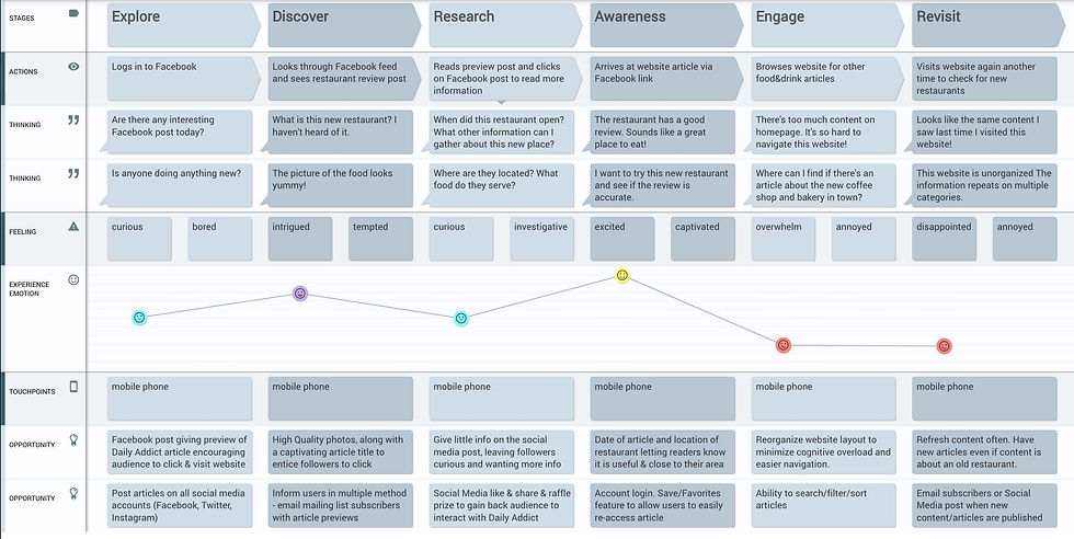
THE CONSUMER EXPERIENCE
Journey map highlighting pain points and opportunities for improvement.
5. What type of contents resonate with consumers on social media?
SOCIAL MEDIA ENGAGEMENT
Low engagement was observed on Daily Addict’s Facebook posts, with one article reaching 600 users but generating only 4 clicks and 4 reactions, indicating minimal interaction.
CONSUMER PREFERENCE
A significant engagement gap was identified, with competitors generating 100,000–200,000 weekly interactions compared to Daily Addict’s 297.

RECOMMENDATIONS
Win consumers back by using the empathy map to inform Daily Addict's redesign.
-
Implement visual hierarchy and to reduce information on home page to avoid information overload
-
Improve information architecture using appropriate content categories from card sorting
-
Fix mobile responsive behavior (consumers use phone to access website
-
Refresh website content often. Archive older content
-
Improve SEO keywords

WHAT'S PREVENTING USERS FROM COMING BACK?
This empathy map surfaces what users think, feel, and do, providing a shared understanding of their needs and pain points to inform user-centered solutions.
BEFORE...
-
Not mobile responsive
-
Lack of white space affected readability and increased information overload
-
Legibility (tiny parapraph font size)
-
Lacked visual appeal

MY RECOMMENDATION:
-
Simplify the information architecture to reduce friction when finding content
-
Improve mobile responsiveness to ensure a consistent experience across devices
-
Create content aligned with user interests to increase relevance and engagement
-
Maintain a consistent publishing schedule to keep users returning for new content
-
Use social media to surface relevant content and guide users back to the website
AFTER..
-
Use branding color (red) for category headings to strengthen visual hierarchy and draw attention
-
Limit to two latest articles per category on the landing page to reduce information overload

Hick's Law:
Limit navigation choices to reduce cognitive overload and support faster decision-making.
Surface the top 6 article categories based on card sorting, and use an accordion-style menu to organize sub-categories.
This approach simplifies navigation, reduces overwhelm, and helps users find content more easily.